Story by Art Department / September 24, 2020
Mixing patterns is a great way to add interest, color, and depth while giving your space a unique look. Incorporating different patterns into your design can be incredibly intimidating, we get it. Choosing the right color scheme in a room can be stressful enough; it quickly becomes overwhelming when you also throw prints into the mix. The trick to learning how to execute pattern mixing like a pro is understanding the basics. Before you start here are a few tips that will steer you in the right direction.
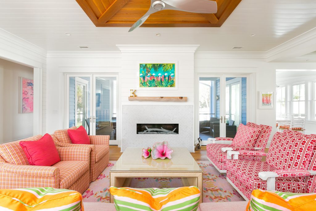
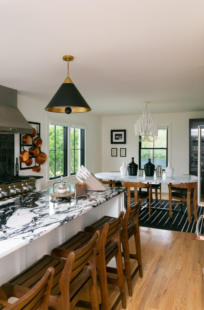
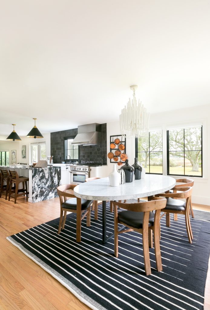
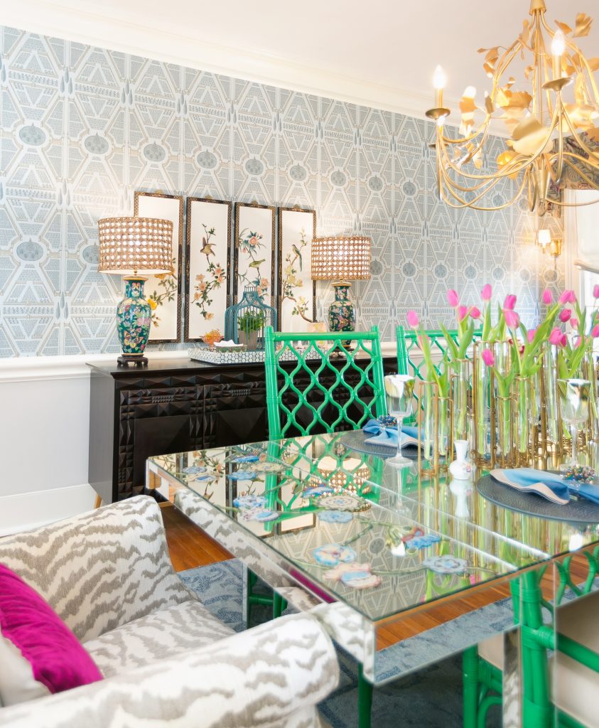
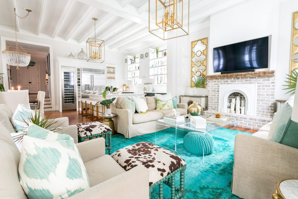
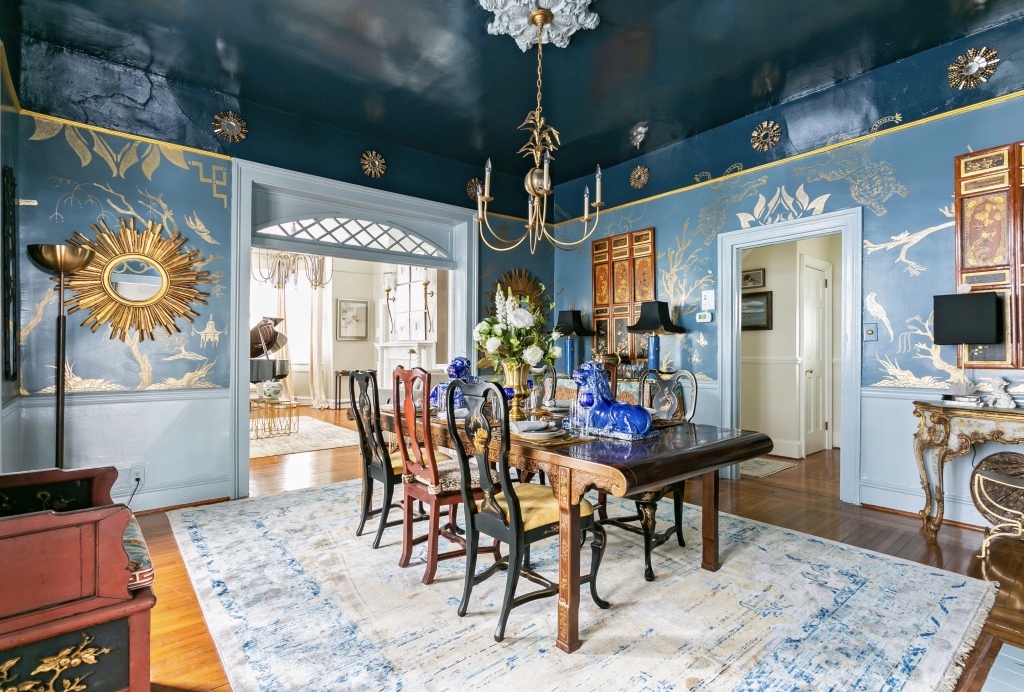
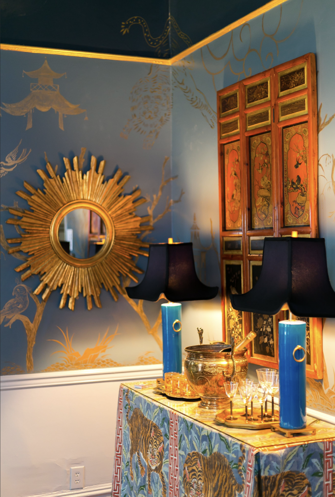
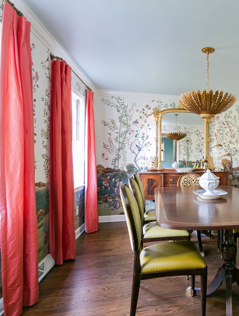
Before you worry about pattern, select a color palette that you love. Choose one or two main colors and one or two complimentary colors. When selecting your scheme, stick to colors that have the same hue and intensity- don’t mix pastels with primary colors, or muted shades with vibrant jewel tones. The simplest way to mix patterns together is to use prints in similar tones. Blue and green tones work well together, pink and blush look lovely, red and orange look warm and vibrant, and you can’t beat timeless grey and black.
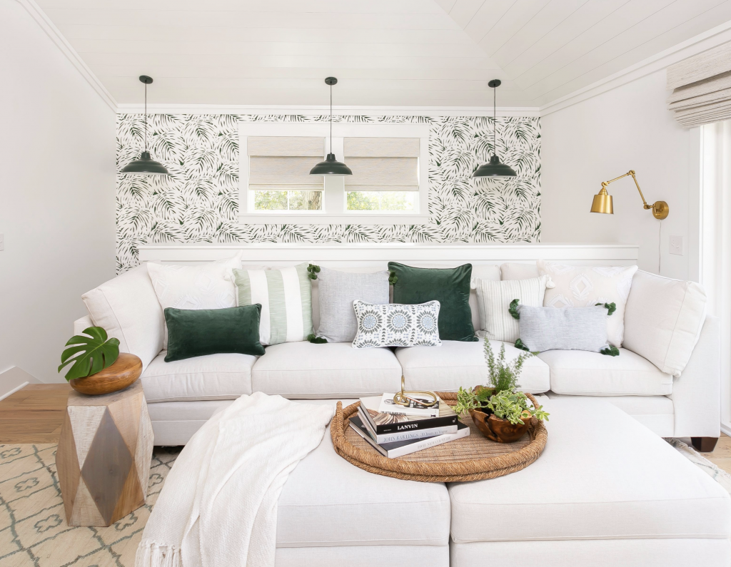
Another safe route when combining patterns is to choose one fabric with a white background. Use your imagine when selecting your color scheme. Opt for green and white for an earthy, boho theme or stick to monochromatic with whites and creams. Then integrate prints of that color in polka dots, stripes, or whichever bold print creates a statement without being overwhelming for the eyes.
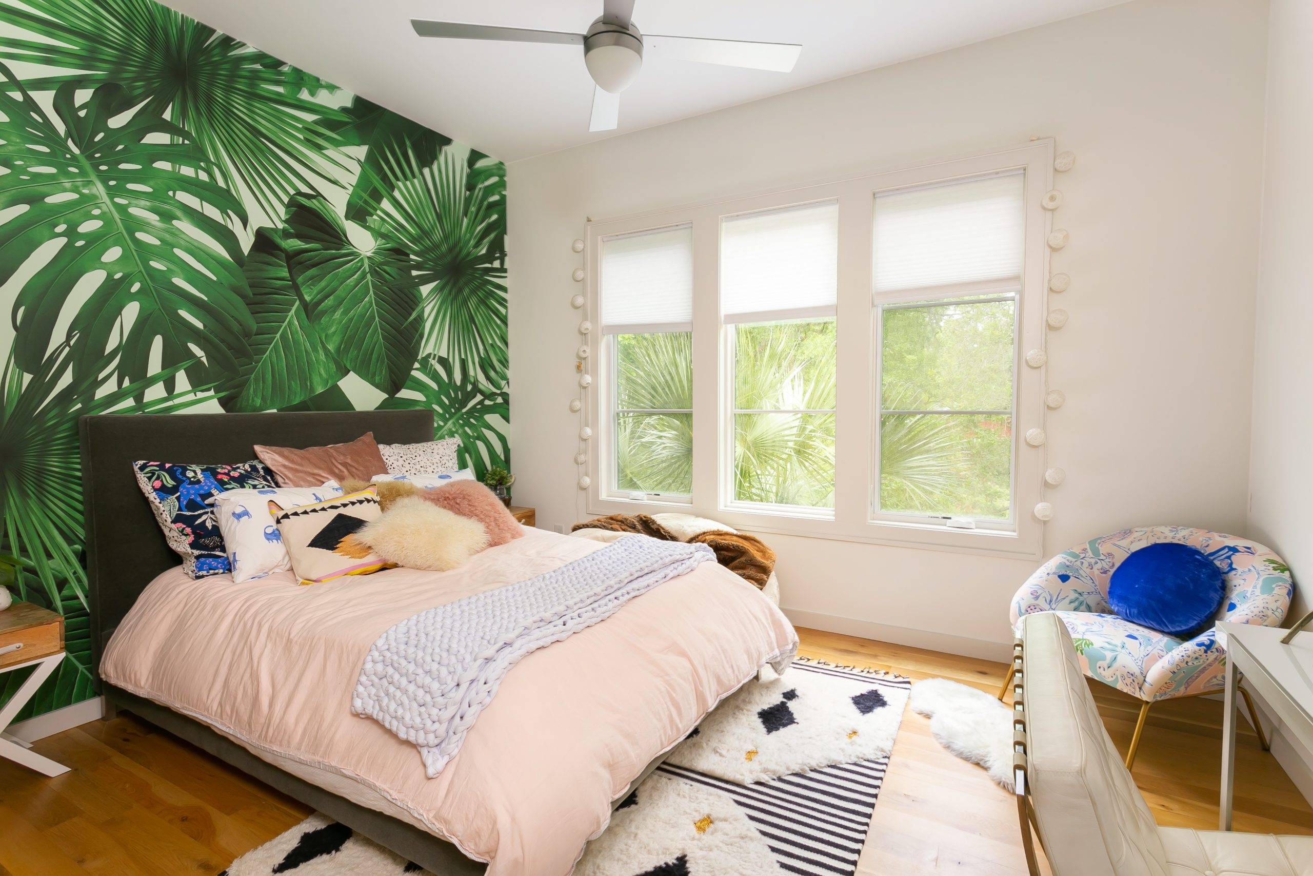
Let neutral colors be your base when working with large patterns. Start off with a neutral color on the walls and floors then add layers of pattern in your rug and accent furniture. Bold prints work beautifully with subdued neutral tones.
If you decided to go with a monochromatic theme, consider adding one accent color that elevates the space and makes your room pop. Think about which color will make your patterns stand out and add splashes of it throughout the room with a well placed vase, books, or throw. Plants are a great way to add an accent color if want a natural feel that will breathe life into your space.
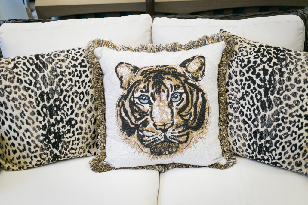
When decorating with pattern determine what look you want your room to have. For example, florals give a room a feminine feel while animal print gives it a glamorous or eclectic vibe.
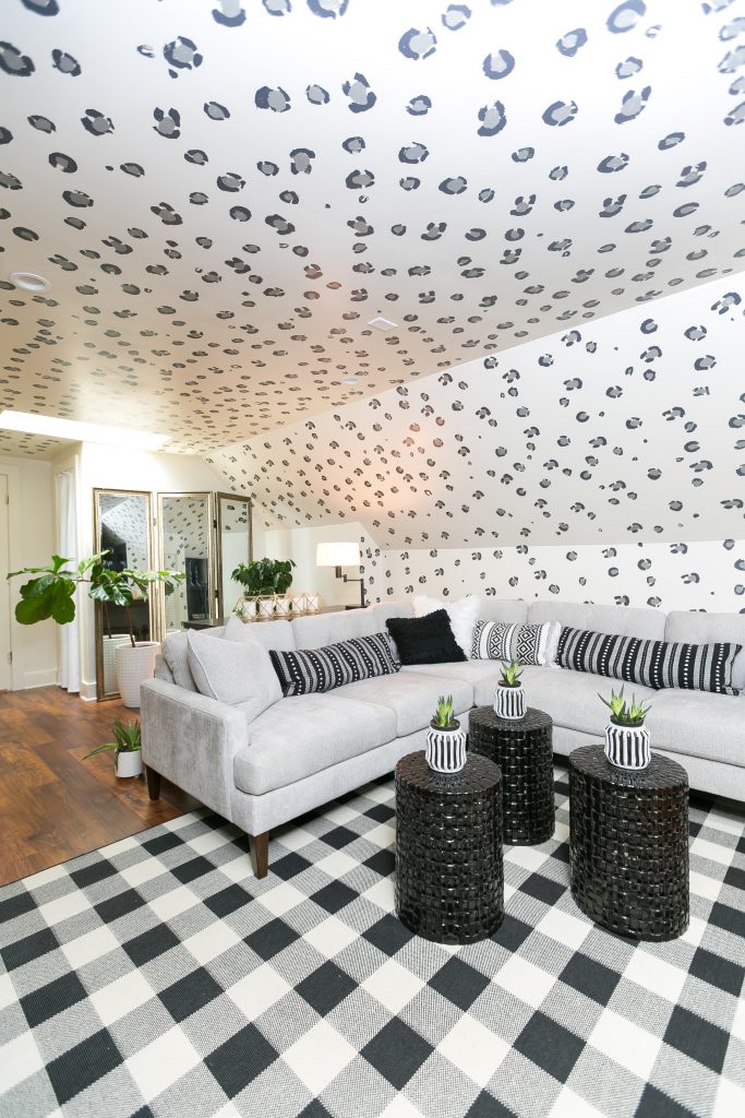
As a general rule, three is the minimum number of patterns you should use. Odd numbers, especially the number three, just seem to make things work, whether you’re combining colors or making flower arrangements.
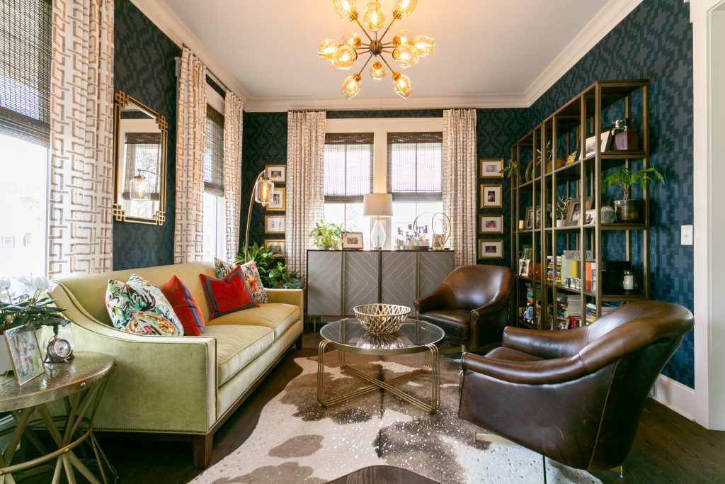
The key to successful print mixing is to mix up the pattern sizes. For example, if you have a wide stripe, use a smaller floral print. If you are using a large buffalo check, use a thinner stripe. Don’t use all of the same pattern – mix it up.
Pattern 1: Pick the main pattern carefully because it will make the strongest statement in the room. Choose something you absolutely love and are inspired to design the whole space around. It’s best to start with a large scale pattern.
Pattern 2: Select a different pattern that’s half the scale or size of the first pattern. If your first pattern is animal, the second pattern could be a plaid or geometric shape that has some of the same colors as your first pattern.
Pattern 3, 4, & 5: Once you have picked your primary and secondary prints, then you’ll want to add at least one or three (remember the odd number rule) smaller prints. Go for complimentary colors or neutral textured pieces. The easiest way to do this is with scattered cushions, or small decorative items.
Distribute patterns evenly throughout the room, keeping patterns to one side of a room will throw the whole space off balance. Be aware of other design elements of the room, such as a fireplace or crown molding, that contain patterns. These elements need to be considered in the grand scheme.
If you think of your room as a pie chart, about 60 percent should be the primary and secondary bold prints, 20 percent smaller prints and designs, and 10-15 percent neutrals. The eye needs a place to rest so layering too many patterns will look and feel chaotic. For example, if your walls have a heavy print, add solid curtains. Patterns work best when they have plenty of space to breathe.
If you still feel hesitant to dive into the world of pattern mixing, look into companion fabrics. Many fabric companies have made the process easier for you by creating multiple patterns designed to work harmoniously together in one room. Just head to the fabric store with a color palette in mind and the patterns are already coordinated for you.